Developing an inclusive website accessible to people with diverse abilities is not only best practice, but pivotal to user experience (UX). With 1-in-6 Australians living with a disability, it’s important that users can navigate your website in an unobtrusive and intuitive way.
What is website accessibility?
Website accessibility is the practice of designing and developing websites so they can be easily used by people of all abilities and disabilities. This includes those with visual, auditory, motor and cognitive impairments. Accessible websites ensure that all users can navigate, understand and interact with online content. By adhering to accessibility guidelines and standards, like the Web Content Accessibility Guidelines (WCAG), developers can create inclusive digital experiences that provide equal access to information and functionality for all.
Why is website accessibility so important?
1. Increased visibility
The more users who can visit and use your website the better, right? By making your website accessible, it means more people have equal access to your website and you don’t miss out on potential leads and conversions.
2. It demonstrates your commitment to inclusivity
An accessible website shows your brand’s commitment to diversity and inclusion; qualities that are highly regarded amongst blue brands.
3. It boosts your Search Engine Optimisation (SEO)
Positive user experience and engagement benefits your SEO. Google will recognise your website’s accessibility and reward you with better rankings.
How is website accessibility enforced in Australia?
The Disability Discrimination Act 1992 (DDA) protects people with disabilities from discrimination. This protection applies across areas of work, accommodation, leisure, education, as well as goods and services.
A number of ‘blue industries’ must comply with the DDA’s website accessibility laws including:
- Government
- Banking & Finance
- Transport
- Education
- Employment
- eCommerce
- Tourism
Failing to comply with the DDA can result in a civil claim against your business. For example, in 2014 a complaint was filed against Coles Supermarkets by a visually impaired woman because their online shopping service was not accessible to her. This case went up as high as the Federal Circuit and Family Court of Australia with talks of millions of dollars in damages.
How to make your website accessible
Now that you have some background into website accessibility, let’s have a look at the best practices for implementation.
1. Make your content easy to see by ensuring enough colour contrast
Colour contrast measures the perceived difference in brightness between two colours, represented as a ratio ranging from 1:1 to 21:1. WCAG has a Contrast Checker to help you determine whether the colours you are using sit within this ratio.
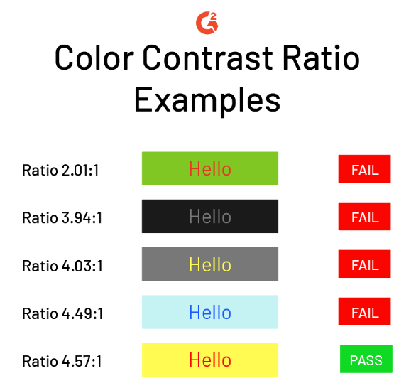
Source: G2
By using an appropriate colour contrast, individuals with colour blindness can easily read your content.
2. Use alt text
For all the non-text areas of your website, such as images, videos and audio, there should be a text alternative so those with blindness, low vision or hearing impairment can understand the content.
Screen readers will be able to pick up what the media is and appropriately describe it to the user.
3. All inputs and form elements would include textual labels
All form fields and elements should have clear textual labels associated with and positioned adjacent to them. This helps the user clearly understand what information needs to go into each field.
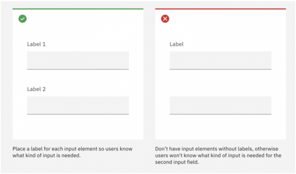
Source: Ibm Equal Access Toolkit
4. Provide alternative ways to consume audio and video content
Using closed captions on your videos is an absolute must for users with hearing limitations. All audio should have a full transcript of the recording provided as well. This can also be done for video.
5. Avoid the use of flashing or blinking content
According to the World Wide Web Consortium (W3C), content that flashes or blinks for more than three times in a second can trigger a seizure. If this can’t be avoided for any reason, visitors must be shown a clear warning.
6. Ensure your menu is easy to find and navigate
Your website’s navigation should be easy to locate and interact with. There should also be alternative features provided such as a site search function or a site map. (Site maps are a must for SEO anyway).
7. Support keyboard navigation
Make sure your website can be navigated without the use of a mouse or touchpad, via the keyboard. For example, the tab key should let users jump between selectable elements on your webpage. The enter key should then be able to ‘click’ that element.
8. Ensure your content is easy to see and read
Create scannable content that makes your website easy to understand and reduces cognitive overload. Headings should be used to organise content into relevant groups. White spacing also helps create clear relationships between headings and paragraphs.

Source: TGPI
If you’d like to see how your website ranks for accessibility, there are a number of online tools available that can give you an accessibility score and recommendations for improvement.
- All
- AI Search & Marketing
- Digital Marketing
- Digital Strategy
- Ecommerce
- Google Analytics
- Instagram Stories
- Marketing
- Meta
- Search Engine Marketing
- Search Engine Optimisation
- Social Media
- Social Media
- Social Media Advertising
- Social Media Marketing
- Social Media Strategy
- Uncategorized

Once upon a time, Black Friday was a single weekend event that followed Thanksgiving in the U.S. It's basically their version of Boxing Day sales but with [...]
People are opening your emails. They’re clicking your links. But… they still haven’t converted. You're first reaction is probably, "My emails aren't working." But that's not actually [...]

We’ve entered a new era of marketing - one where your content is no longer just read by people. It’s interpreted by AI. From Google’s Search Generative [...]
For months, we’ve all been wondering what the future holds for Google Ads with AI Overviews and the new AI Mode changing the way people interact with [...]

It’s not your imagination - social media feels a little quieter these days. Posts that once racked up likes, comments and shares are now met with a [...]
Something has shifted online this year, and if you work in marketing, you’ve felt it. Feeds feel noisier, yet somehow emptier. Search results loop endlessly. Trends peak [...]

Engaging with your audience may be more powerful than most social media teams realise. A new data study from Buffer has revealed that responding to comments on social [...]

Once upon a time, Black Friday was a single weekend event that followed Thanksgiving in the U.S. It's basically their version of Boxing Day sales but with [...]

People are opening your emails. They’re clicking your links. But… they still haven’t converted. You're first reaction is probably, "My emails aren't working." But that's not actually [...]

We’ve entered a new era of marketing - one where your content is no longer just read by people. It’s interpreted by AI. From Google’s Search Generative [...]

For months, we’ve all been wondering what the future holds for Google Ads with AI Overviews and the new AI Mode changing the way people interact with [...]

It’s not your imagination - social media feels a little quieter these days. Posts that once racked up likes, comments and shares are now met with a [...]

Congratulations. You’ve already beaten the odds. On average, 8 out of 10 people will read the headline of a piece of content - but only 2 out [...]

AI tools like ChatGPT, Google Gemini and Perplexity are quickly becoming part of how people discover websites. Instead of searching Google directly, users are asking AI tools [...]

We often hear that attention spans are decreasing, particularly among Gen Z. Social media platforms like TikTok and Instagram are often blamed, with headlines suggesting that endless [...]

